
Circular statistical graphic | pie
By Eric Melse | Feb 16, 2022
This post shows how to include a Stata pie chart into your report. First, for this example some fictional data is entered that is used to create a circle diagram, a circular statistical graphic that is divided into slices like a pie or pizza (Smith 2017).
* Preliminaries
net install cleanplots, from("https://tdmize.github.io/data/cleanplots") replace
set scheme cleanplots
clear all
* Load the example dataset (manual input)
input sales marketing research development
sales marketing research development
12 14 2 8
end
label var sales "Sales"
label var market "Marketing"
label var research "Research"
label var develop "Development"
* Use the first asdocx command and create the MS word file, after that,
* asdocx adds results to this file
asdocx, text(Example of using a pie graph in asdocx) fs(12) ///
font(Arial) save(Example_asdocx_graph_pie.docx) replace
asdocx, text(\par) append
* Include a pie graph to MS Word using asdocx
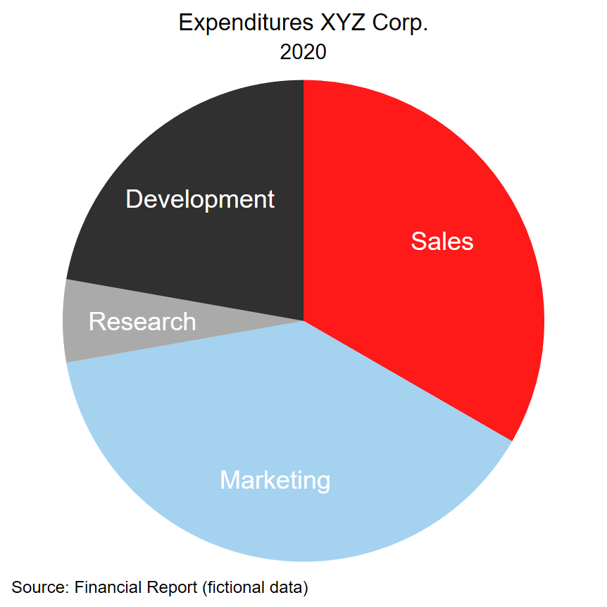
asdocx, text(Figure 1. Pie graph example using scheme cleanplots (Mize 2021).)
asdocx graph pie sales marketing research development, ///
plabel(_all name, size(*1.5) color(white)) xsize(4) ///
ysize(4) legend(off) plotregion(lstyle(none)) ///
title("Expenditures XYZ Corp.") subtitle("2020") ///
note("Source: Financial Report (fictional data)") append pagebreak(after)
* Include a pie graph to MS Word using asdocx
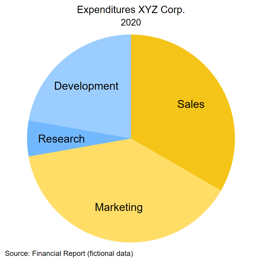
asdocx, text(Figure 2. Pie graph example using own colors.)
asdocx graph pie sales marketing research development, ///
pie(1, c("244 189 0")) pie(2, c("255 201 14%70")) ///
pie(3, c("98 176 255")) pie(4, c("98 176 255%70")) ///
plabel(_all name, size(*1.5) color(black)) xsize(4) ///
ysize(4) legend(off) plotregion(lstyle(none)) ///
title("Expenditures XYZ Corp.") subtitle("2020") ///
note("Source: Financial Report (fictional data)")
asdocx clear // finally, delete stored files
The file created by asdocx can be accessed from here Example_asdocx_graph_pie
The first graph looks like this.
The second graph that uses own color is shown below.
Pie charts are extensively used as a business graphic, typically in annual reports. However, for statistical usage the pie chart is criticized by many on the one hand (data-to-viz, Hamberg), as well as defended (Aleksejeva 2015, Emery 2015, Few 2007, O’Reilly, Viguier 2018).
Whatever your position on the subject might be, should you need it, asdocx does support the inclusion of a pie chart.
Also note that a better alternative for the pie chart might be the so-called donut chart, which is created starting from a pie graph and then using Stata’s graph editor (Musau 2021).
References
Aleksejeva (2015) – https://infogram.com/blog/the-infamous-pie-chart-history-pros-cons-and-best-practices/
data-to-viz – https://www.data-to-viz.com/caveat/pie.html
Emery (2015) – https://depictdatastudio.com/when-pie-charts-are-okay-seriously-guidelines-for-using-pie-and-donut-charts/
Few (2007) – https://www.perceptualedge.com/articles/visual_business_intelligence/save_the_pies_for_dessert.pdf
Hamberg – https://funnel.io/blog/why-we-dont-use-pie-charts-and-some-tips-on-better-data-visualizations
Musau (2021) – The Stata Journal, 2021, 21 (4), 1069-1073. Musau, A., Stata tip 143: Creating donut charts in Stata https://journals.sagepub.com/doi/abs/10.1177/1536867X211063414?journalCode=stja
O’Reilly – https://www.oreilly.com/content/in-defense-of-the-pie-chart/
Smith (2017) – https://yougov.co.uk/topics/politics/articles-reports/2017/03/06/does-pineapple-belong-pizza
Viguier (2018) – https://medium.com/@clmentviguier/the-hate-of-pie-charts-harms-good-data-visualization-cc7cfed243b6