

Table of contents
1. What is line chart?
line command to create line charts for visualizing trends and relationships between variables, especially over time or ordered sequences. It plots lines connecting data points, making it easy to see patterns and changes. Key features of line charts include:
- Visualizes trends and relationships between a dependent variable (y) and an independent variable (x).
- Effective for time-series data, showing changes over time.
- Can display multiple lines on the same graph to compare different series.
- Highly customizable appearance through various options for line styles, colors, markers, and labels.
- Can be combined with other graph types like scatter plots for enhanced visualization.
The basic syntax for creating a line chart in Stata is:
[code]*Syntax of the line command in Stata
line varlist [if] [in] [, options] [/code]
Where varlist specifies the variables to be plotted. For a simple line chart, varlist typically includes a y-variable followed by an x-variable ( yvar xvar). Key options include:
connect_options– control the appearance and connection of lines.axis_choice_options– assign plots to specific axes.twoway_options– for titles, legends, axes, and overall graph appearance.
The line command is versatile and can be used in several ways to create informative visualizations. Let’s explore its usage with examples.
2. Basic Usage of line chart
The most straightforward use of the line command is to plot a simple line chart. Let’s start with time-series data to illustrate this.
line le year
[/code]This sequence of commands first loads the uslifeexp dataset, which contains data on US life expectancy over the years. The line le year command then generates a line chart with ‘year’ on the x-axis and ‘le’ (life expectancy) on the y-axis. This is a basic yet effective way to visualize how life expectancy has changed over time.
It’s important to understand the relationship between line and scatter commands in Stata. In essence, line is a specific type of `scatter` plot where points are connected by lines and markers are hidden by default. The following commands produce nearly identical graphs:
scatter yvar xvar, msymbol(none) connect(l)[/code]
Both commands will plot yvar against xvar and connect the points with lines. The second command explicitly uses scatter but with options to remove markers (msymbol(none)) and connect points with lines (`connect(l)`), effectively mimicking the linecommand’s default behavior.
Line charts are also very useful for displaying predicted values and confidence intervals in regression analysis. Consider the following example using the auto dataset:
quietly regress mpg weight
predict hat
predict stdf, stdf
generate lo = hat – 1.96*stdf
generate hi = hat + 1.96*stdf
scatter mpg weight || line hat lo hi weight, pstyle(p2 p3 p3) sort[/code]
Here, after performing a regression of mpg on weight, we predict the fitted values (hat) and standard errors (stdf). We then generate lower (lo) and upper (hi) bounds for the confidence interval. The final command overlays a scatter plot of the original data (mpg vs weight) with lines representing the predicted values and confidence intervals. The sort option is necessary here to ensure the lines are drawn correctly as the auto dataset is not sorted by weight. pstyle(p2 p3 p3) is used to style the confidence interval lines consistently (see Stata help for pstyle).
3. line chart Options
line command offers a wide array of options to customize the appearance and details of your line charts. These options fall into several categories, allowing for precise control over various aspects of the graph. The main option categories are:
- connect_options: Control how data points are connected and the visual style of the lines.
- axis_choice_options: Associate specific plots with particular axes in multi-axis graphs.
- twoway_options: A comprehensive set of options for titles, legends, axes, added text, and overall graph formatting, common to all `twoway` graphs.
3.1 connect_options
connect_options are used to modify the look of the lines and how points are connected. This includes options for line patterns, widths, colors, and connection styles. Refer to [G-3] connect_options in Stata help for a full list. Common connect_options include:
connect(l): (default) Connect points with straight lines. Other styles includestairstep,spike,bar, and more.lpattern(): Specify line pattern (e.g.,solid,dash,dot,longdash).lwidth(): Control line thickness (e.g.,thin,medium,thick, or a numeric value).lcolor(): Set line color (e.g.,red,blue,green, or color names/codes).
For example, to create a line chart with dashed red lines:
[code]sysuse uslifeexp, clearline le year, lpattern(dash) lcolor(red)[/code]
3.2 colorvar_options
3.3 axis_choice_options
axis_choice_options are essential when creating graphs with multiple y-axes or x-axes. They allow you to associate each plot with a specific axis. Key options include yaxis() and xaxis() to specify which y or x axis a particular plot should use. See [G-3] axis_choice_options for more information.
3.4 twoway_options
twoway_options provide extensive control over the overall appearance of the graph, including titles, legends, and axis labels. These are common options that work with all `twoway` graph types. Refer to `[G-3] twoway_options` for a complete list. Frequently used `twoway_options` include:
title()/subtitle()/note(): Add titles, subtitles, and notes to the graph. Styles can be customized usingtitlestyle(),subtitlestyle(), andnotestyle().legend(): Customize the legend, including labels, position, and appearance. Uselegend(label(1 "Line 1") label(2 "Line 2"))to relabel legend items.xlabel()/ylabel(): Control the labels on the x and y axes, including the range, increment, and specific labels. Usexlabel(1900(25)2000)to set labels every 25 years from 1900 to 2000.ytitle()/xtitle(): Set the titles for the y and x axes.yaxis()/xaxis(): Control axis properties, such as range, scaling, and grid lines.yaxis(1 2)is used to specify options for multiple y-axes.ylabel(, grid)adds grid lines to the y-axis.
Let’s revisit the US life expectancy example to create a more informative and visually appealing graph using these options:
[code]sysuse uslifeexp, cleargenerate diff = le_wm – le_bm
label var diff “Difference”
line le_wm year, yaxis(1 2) xaxis(1 2) || line le_bm year || line diff year || lfit diff year ||, ///
ytitle(“”, axis(2)) xtitle(“”, axis(2)) xlabel(1918, axis(2)) ylabel(0(5)20, axis(2) grid) ylabel(0 20(10)80) ///
ytitle(“Life expectancy at birth (years)”) title(“White and black life expectancy”) subtitle(“USA, 1900 to 1999”) ///
note(“Source: National Vital Statistics, Vol 50, No. 6” “(1918 dip caused by 1918 influenza pandemic)”) ///
legend(label(1 “White males”) label(2 “Black males”))[/code]
This advanced example demonstrates how to combine multiple line plots, add a linear fit (lfit), customize axes with yaxis() and xaxis(), add titles, subtitles, notes, and a customized legend using twoway_options to create a publication-quality graph.
4. Cautions When Using Line Chart
line command is the order of your data. Ensure your data is sorted by the x-variable before plotting, or explicitly use the sort option within the line command. If the data is not properly sorted, Stata will simply connect the points in the order they appear in the dataset, leading to misleading and nonsensical “scribbled” line charts.Consider this example using the auto dataset, which is not sorted by weight:
[code]sysuse auto, clear
line mpg weight[/code]
Running these commands without sorting will result in a chart where lines crisscross randomly, making it uninterpretable. This is because Stata connects each observation to the next in the dataset’s current order, not based on the weight variable’s values.
To correct this, always ensure that your data is sorted by the x-variable, or use the sort option:
scatter mpg weight || line mpg weight, sort
[/code]or sort the data beforehand:
[code]sysuse auto, clearsort weight
line mpg weight
[/code]Both corrected approaches will produce a meaningful line chart where the points are connected in the order of increasing weight, providing a clear visualization of the relationship between weight and mpg.
Plotting multiple lines
twoway command is used to combine multiple graph types. Consider the following example using grunfeld dataset. This dataset contains panel data for 10 firms over 20 years (1935–1954). In this example, we’ll plot the investment levels over time for two firms (Firm 1 and Firm 2) on the same graph.[code]* Load the built-in Grunfeld datasetwebuse grunfeld, clear
* Plot investment over time for Firm 1 and Firm 2
twoway (line invest year if company == 1, sort lcolor(blue)) ///
(line invest year if company == 2, sort lcolor(red)), ///
title(“Investment over Time for Firms 1 and 2”) ///
xtitle(“Year”) ytitle(“Investment”) ///
legend(label(1 “Firm 1”) label(2 “Firm 2”))[/code]
(line invest year if firm == 1, sort lcolor(blue)):
Plots a blue line for Firm 1’s investment over time. Theif firm == 1condition restricts the plot to Firm 1. Thesortoption ensures that the data points are connected in order of theyearvariable.line invest year if firm == 2, sort lcolor(red)):
Plots a red line for Firm 2’s investment over time.title("Investment over Time for Firms 1 and 2")adds a main title.xtitle("Year")andytitle("Investment")label the axes.- The
legend()option provides labels for the two lines.
twoway vs line
line command is a shorthand for the more general twoway line command. For basic line plots, both commands function identically, producing the same graphical output. The distinction arises in more complex scenarios. twoway syntax allows for the combination of multiple plot types within a single graph. For example, you can overlay a line plot with a scatter plot or a linear fit (lfit) using the twoway framework. In simpler cases, choosing between line and twoway line for a single line plot is purely a matter of preference as they are functionally equivalent.
* Both commands produce the same basic line chart
line yvar xvar
twoway line yvar xvar

* twoway syntax allows combining plot types
twoway (line yvar xvar) (scatter yvar xvar) (lfit yvar xvar)
Line graph in panel data
line chart can display individual company trajectories and the overall market trend. To achieve this in Stata, plot multiple lines representing each company’s sales against time. Simultaneously, overlay a line showing the average sales across all companies for each time period. The following example is takken from this page.
[code] * Load pig data
webuse pig, clear
egen mean = mean(weight), by(week)
egen tag = tag(week)
line weight week, c(L) xla(1/9) lc(gs12) || line mean week if tag , ///
ytitle(“Sales Revenue (Units)”) ///
legend(order(2 “Average Sales” 1 “Company Sales”)) ///
xtitle(“Years”) title(“Company Sales Over the Years”)
Combine line with bar chart
input str40 Sector Coverage Ratio
“Agriculture; ” .85813358 0.52
“Mining ” .89187858 0.13
“Manufacturing ” .36191116 0.29
“Electricity; ” .68654997 0.18
“Construction ” .13923316 0.36
“Wholesale ” .62995644 0.35
“Transport; ” .34724069 0.27
“Financial Services ” .75544079 0.22
“CSP ” .90706484 0.31
“Private Households ” .9931992 0.80
end
g Sector1=_n
labmask Sector1, val(Sector) // ssc install labmask
twoway bar Coverage Sector1, ylab(0(.2)1, ///
notick) barwidth(.7) xtitle(“”) ytitle(“”) ///
xla(1/10, valuelabel notick ang(90)) || ///
line Ratio Sector1, sort[/code]
Waterfall with line chart
waterfall plot approach is to compute a running (cumulative) total and then—for each step—plot the area between the previous total (the baseline) and the new total.[code]
clear
input str10 group float(effect)
“control” -5
“treatment” 10
“control” -3
“treatment” 8
“control” -2
“treatment” 6
end
* Create an ordering variable (index)
gen index = _n
*Compute cumulative total
gen cum_effect = sum(effect)
* Compute the base (starting point) for each bar
* For each observation, the bar goes from the previous total (base) up to the new total.
gen base_effect = cum_effect – effect
* Plot waterfall chart with separate colors by group
twoway ///
(rarea cum_effect base_effect index if group==”control”, ///
color(blue%50) lcolor(blue) legend(label(1 “Control”))) ///
(rarea cum_effect base_effect index if group==”treatment”, ///
color(red%50) lcolor(red) legend(label(2 “Treatment”))) ///
(line cum_effect index, lwidth(medthick) lcolor(black)), ///
ytitle(“Cumulative Effect”) xtitle(“Step”) ///
title(“Waterfall Plot: Control (blue) vs. Treatment (red)”)[/code]
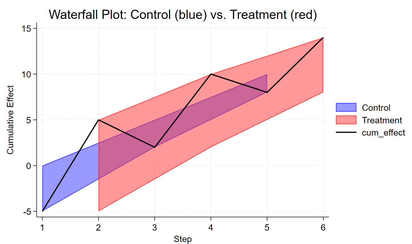
waterfall-with-line-chart
Line chart with categorical variable on x=axis
The following Stata code demonstrates how to create this visualization:[code] sysuse auto, clear
gen test_coupon = foreign
gen revenue = mpg
gen acquisition = round(head)
collapse (mean) mean=revenue (semean) se=revenue, by(test_coupon acquisition)
gen ub = mean + 1.96*se
gen lb = mean – 1.96*se
twoway line mean acquisition if test_coupon || ///
line mean acquisition if !test_coupon || ///
rcap ub lb acquisition if test_coupon || ///
rcap ub lb acquisition if !test_coupon, ///
title(“Average Revenue by Acquisition Channel”) ///
xtitle(“Acquisition Channel”) ///
ytitle(“Average Revenue”) ///
legend(label(1 “Test Coupon Used”) label(2 “No Coupon Used”))[/code]